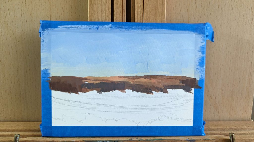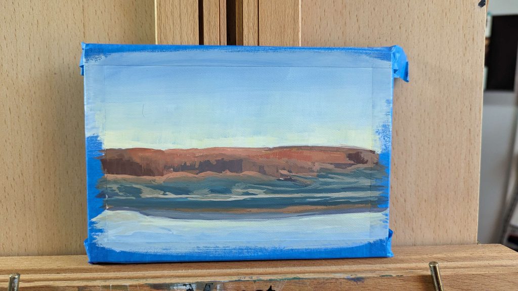
I decided to paint one of my many backlogged photos that I took on a trip to Yellowstone National Park in 2022.
It was cold, crisp and beautiful. I had been in the summer before, but never in late October. Unfortunately, we weren’t there for long to admire its’ splendor. But we did get to enjoy a Wyoming star gaze on our way back and that was amazing too! The milky way never looked so good.
I’ve really been on a gouache painting kick lately. It’s easy to pick up, water based, and pretty. It can be thinned or used opaquely. It’s very versatile. It’s quickly becoming my favorite painting medium. No solvents, easy cleanup and so pretty.
So I will take you through how I painted this, step by step. Let’s get into it!
I use M Graham Gouache. It’s the only brand I’ve tried and so far I really have been enjoying using it. It’s expensive, but worth it. I also paint quite small. This painting is on 5 x 7 inch watercolor paper.
Supplies
Color List:
- Hansa Yellow 107
- Pyrrol Red 154
- Ultramarine Blue 190
- Prussian Blue 153
- Yellow Ochre 200
- Burnt Sienna 020
- Burnt Umber 030
- Titanium White 180
Other Materials Used:
- Fabriano 5 x 7 Inch hot pressed watercolor paper
- Water
- White shop rags
- Mimic Kolinsky watercolor brushes
Step 1: Preparing my paper
The first step I always take is to block off any areas of my paper that I don’t want paint to get onto. I like a clean border for framing and viewing.
I take my painters tape (happened to be blue at the time) and make 1/2 inch border all the way around my paper. I also make sure it’s straight.
After that, I like to make a simple sketch (about 2 or 3 minutes) to just give myself general guidelines for where I want certain elements of the painting to be, keeping composition in mind.
I then begin painting in my sky and the tree line. With this painting, I worked from background to foreground.
I’m still experimenting with the best approach in gouache painting for myself. Maybe it just depends on the subject for each painting.
I used ultramarine and hansa yellow, mixing tints with titanium white for the sky. For the trees, I used yellow ochre, pyrrol red, burnt sienna, burnt umber and titanium white (permanent white). There may be small amounts of ultramarine blue or prussian blue in there too for some of those dark muted violets.

Step 2: Working on the ground

The next step I took was to start blocking in the grass. I loved the contrast of the warm trees with the cool blues and greens of the grass and dirt. I tried to pay attention to the values of the ground compared to the distant tree line. I wanted to keep my focal point on the bright trees.
I used a lot of Prussian blue and titanium white on the grass. It happened to be really close to the right color I was looking for.
Gouache is tricky because it dries lighter or darker depending on the value of the paint. Light colors tend to dry darker and dark colors tend to dry lighter. It’s trial and error, but that’s okay because I can always paint over it if I get need to make adjustments.
I try to keep my mark making loose and fun! I also try not to get stuck in an area too long so then I don’t overwork it and potentially add details where there aren’t any needed…
At least not yet.
Step 3: The river
In this next step I started to paint the water. I wanted it to reflect the beautiful light blue and green hues that were in the sky. This was particularly tricky because my paint was so light on my palette that it was hard to tell when I had it just right.
It was better for me to make a mark on the paper and just wait for it to dry. That’s the one great thing about gouache, the paint doesn’t stay wet for very long. So checking color and value isn’t too time consuming.
I also put in the very narrow river bank in between the blue grass and the light river.
Then before moving on, I put in the lighter value under the trees, just where the sunlight was barely touching the grass. But it was just enough to give it a muted sunlit glow.
Gouache can be rewet and to blend the blue-green grass and the warm browns, I rewet the blues and gently mixed them together on the paper just where the edges touched.

Step 4: Dirt paths

Next came the dirt. I mixed a beige kind of color that would fit nicely into those dark blue grassy areas. I carefully painted it into the areas with a round brush, just using the tip.
I also gave some extra love to the grass just below the trees to make it more solid and get rid of any white paper leftover.
I also took some more of that really light yellow-green and touched up the sky at the top of the trees. The values of the trees and the sky were too close together. I really wanted the sky to sing.
I also touched up the river bank a bit more. I added some cool blue-violet hues next to the water.
Step 4: Finishing touches
To finish the painting off, I first added some grass in front of the river. I then added some little violet spots into the river to represent little areas of dirt that are emerging out of the river.
Then I went back into the trees to fix values and make them more tree shaped. I also added some bright highlights to really hit those trees in the back with sunlight, which is the focal point.
I also added some lighter values into the river bank where the yellow ochre is.
Pulling the tape off of my painting is the most satisfying part of the whole thing. It always gives the piece a different look compared to when the tape is on it.
And that’s it! I hope you all enjoyed the walk through of this painting! Thanks for reading.
Talk to you soon,
Julie


Leave a Reply