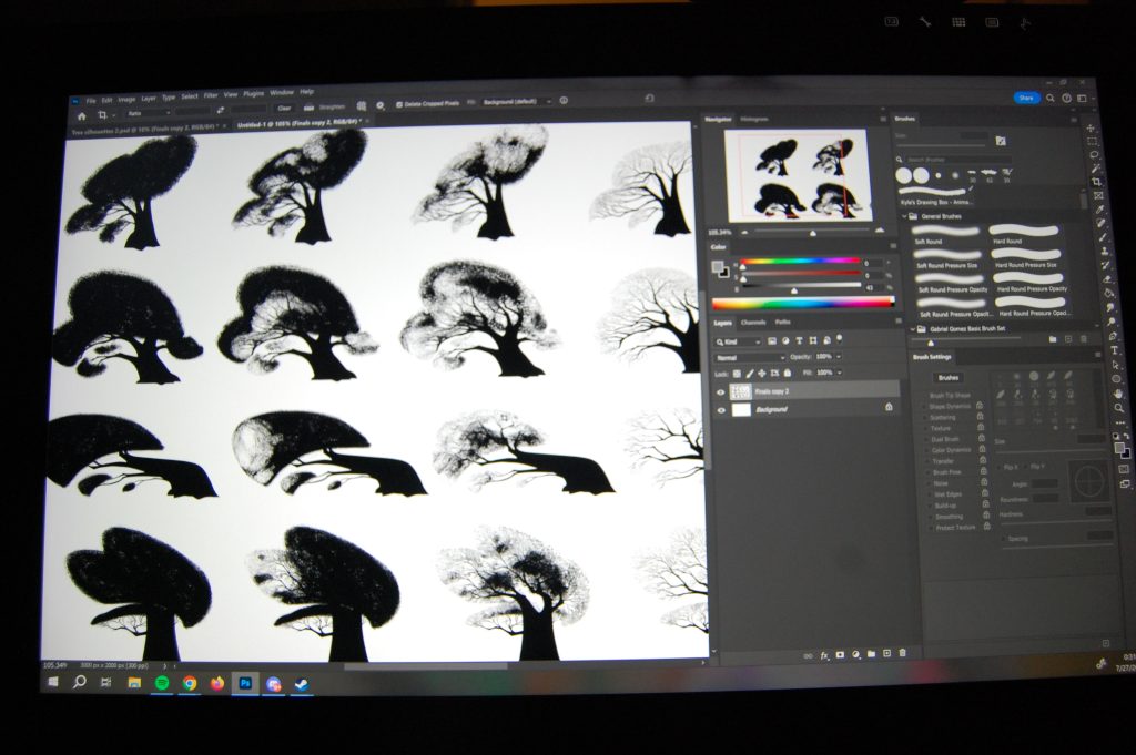
Hey everyone! In this post I’ll be walking you through my steps of how I created these silhouette designs of some elm trees for my personal project, “Elaine”.
The trees you see here are actually my second attempt at this assignment. Trees are quite difficult to design and it took some serious trial and error to get anywhere near what I wanted to achieve.
In design, it is important for shapes to be instantly recognizable. This allows your audience to enjoy what they’re looking at without having to decipher it for themselves.
In film and TV, the audience is shown images on the screen for less than a second sometimes. Readability is the number one thing that I am focused on at all times whether it’s characters, props, or environments.
That’s where designing in silhouettes come in.


Designing in silhouettes allows me to strip away everything less important than shape. Shape is the number one player in design, then comes color and texture.
When designing with silhouettes I use black on a white background. This allows me to focus solely on the shape and readability. Color and texture can alter my view on the shape of a design. So I leave it for the last finishing touches.
To start with, I begin drawing small, quick thumbnails to get out some ideas. My first drawings are usually stiff and generic. As I work through several ideas and iterations, my thumbnails start to go in more of a direction that I want.
After doing some quick sketches, still focusing on shape, readability and what the drawings “feel” like, I move on to picking out three or four designs I feel best fit the mood that I’m trying to depict, based on the stories needs.


Story is king. No matter what I design, story is always in my mind. Everything I design for my personal project supports the story.
When I was designing an elm tree for this particular location, I want it to fit in with the story and support it.
After I get my thumbnails done, I picked a three to four that I like the most and I start to work on the larger, more detailed versions.
First I grab the thumbnail and scale it up with transform tool (hotkey is Ctrl+T) to a working size that is good for me.


For the trunk, I wanted something chunky. I wanted the trunk to feel really solid and stable.
So I made it thick. I drew it up to the height that I wanted the large branches to start. I use the lasso tool primarily for making shapes. It is quick, easy, and exact. It also gives me razor sharp edges. I continue the use of the lasso tool throughout the design process.
After I have my trunk shape established, I then start on the large branches. Using the lasso tool, I make shapes I think will be appealing. I try to pay attention to shape language, negative space, and style.
For style reference, I found some work by Arthus Pilorget that I really loved and wanted to try to have a similar feeling to for my own project. I love, love, love, LOVE, his work. Check him out here. https://www.instagram.com/arthuspilorget/

With the branches, I tried my hardest to go from big, medium, small, smallest with the branches. While working on these trees, it occurred to me that branches on almost all trees I’ve observed so far follow this “rule” of big, medium, small. Being aware of this allowed me to have a realistic looking tree, even when stylized.

After I get the large branches established, I start on the medium sized ones.
I start the medium sized ones on the ends of the large ones, making them split off sometimes as if the tree is actually growing in front of me. This helps me with the logic of how branches separate.
I also make some of the medium ones split on their own branches as well. It would be pretty boring if they were all just one singular branch. Making multiple medium branches off of themselves adds to the realism and believability of the tree.
Next comes the smallest branches.
This is where the tree really starts to come alive. Placing the smallest branches really fills out the tree. With these trees, my brush was at a size 6 pixel size.
So then I just work my way around the tree, each section on different layers. On each section, I also make a clipping mask and then lasso around the edges of the tree to make it uniform and gives it a “graphic” look.

The rest of the process looked like this.


And that finishes up the process of designing the tree itself. This is the same process that I used for all four versions of my elm tree exploration. Next step – foliage.

Unfortunately, I don’t have images for this portion, but it is featured in my time-lapse video on Youtube. I will link it here at the bottom of this post.
With foliage, for me, it’s all about shape design. The basic rules of shape design are as follows:
- Circles/curves – Friendly, soft
- Squares – Stable, strong
- Triangles – Dangerous, unfriendly
- Random angles – Dangerous, chaotic
- Sharp corners- Aggressive, dangerous
So with these basic rules in mind, I wanted a nice, friendly feeling with a bit of protection. Hopefully this is conveyed in my shape choices in the image above.
Following my initial sketch thumbnail, I recreate the shape with a brush that I got from Aaron Blaise’s art brush packs. Check them out here https://creatureartteacher.com/product/aarons-custom-photoshop-brushes-set-1/. I chose a gritty brush that looked like it could be leaves from far away.
I started out with making the “full” leaf version of the tree. In my story, the tree isn’t always at 100% leaf capacity. So, I needed to create different leaf percentages of fullness. So I made a 100%, 75%, and a 25% version of each elm tree variation.
Starting from 100% fullness makes it easier to subtract the leaf shapes and create something that I found appealing. Once I got the 100% version, I duplicated the tree (Ctrl + C and Ctrl + V to paste) alternatively (Ctrl + J to duplicate), slid it over with the arrow keys, made a clipping mask on the tree leaf mass, used black so then I could mask out areas that I wanted to take away, and if I messed up, I either Ctrl + Z-ed, or just completely started over from a new copy/paste of the original.
I followed this step for the last version as well, subtracting even more to get 25% leaves. This was the same process that I did for all my trees foliage.
At the end, I ended up with these versions of elm trees for my exploration phase for my story.

That’s it! Hopefully this was helpful and if you need to make trees of your own for a project, this guide gives you a good starting point.
Thanks for reading!
Talk to you soon,
Julie
PS: Here’s the process video!


Leave a Reply